Physical Interpretation of MX Intensity Maps
1 Table of Contents
2 Introduction & Literature Review
2.1 Scanning White Light Interferometry
2.2 Fringe-Free Intensity Images
3 Height Data vs. Intensity Data
4 Gradient Data Vs. Intensity Data
5 Quality Data vs. Intensity Data
6 Physical Meaning of Intensity Maps
9.1 Areal filter & Image Comparisons
9.3 Create Color Mapped Intensity Image
In the course of working on my current research project, which is primarily concerned with the identification of surface defects on metal AM surfaces, the intensity map provided by scanning white light interferometers using the MX software package has proven to be a very useful tool in identifying regions of interest. For comparison, for the AM metal surfaces I am interested in, here is a comparison of the height map and the intensity map images:
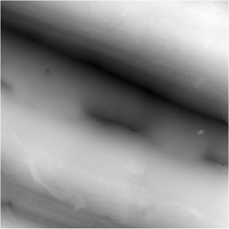
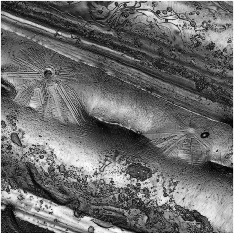
Figure 2.1: Height Map (left) and Intensity Map (right) of AM Metal Surface at 50x (FOV ~ 168 µm)
You can see the stark contrast in detail, especially in the dendritic regions, which are what we are primarily interested in analyzing. The height map shown in Figure 2.1 is not filtered, however. I will attempt to apply spatial filtering to the height map in section 3 to see if doing this can unveil some hidden similarities between the two representations.
Since I am primarily using the intensity maps in my investigations of the defects on the surface, it would be beneficial to understand exactly where the information utilized to construct the intensity map is coming from, and what it means physically. The height map, which the more traditionally utilized measurement corresponds to an obvious physical parameter of the surface, i.e. the relative height, but there isn’t an obvious corresponding physical significance to the intensity images. It’s also notable that the quality of the intensity maps has improved dramatically in recent years, giving even more reason to understand what exactly is being done to produce these images. Is there some underlying connection to the height map that could be unveiled and provide deeper understanding of the information being presented?
2.1 Scanning White Light Interferometry
In order to begin my analysis of the meaning of the intensity data, I must first understand the instrument that is producing it. These intensity maps are generated by scanning white light interferometers (SWLI). This is a type of interferometer that uses light of a relatively short coherence length and measures the interference signal generated on a given sample as it scans towards or away from the sample. Because the coherence length is short, fringes are observed only in a very limited range of distances from the microscope objective.
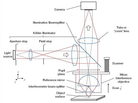
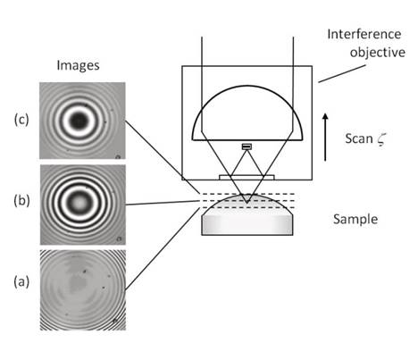
Figure 2.2 Diagram of Scanning white light interferometer (left) and demonstration of its operating principle (right) [1]
For any given pixel being on the camera, you will get a signal that looks like the following:
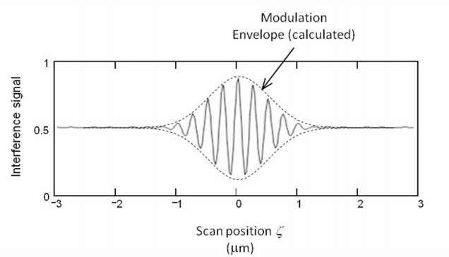
Figure 2.3: SWLI signal for a single pixel [1]
Where the peak of the modulation envelope at each pixel will correspond to the relative height of the surface at the point the pixel is measuring.
2.2 Fringe-Free Intensity Images
Since the SWLI is a microscope, ultimately, it is capable of taking intensity images. However, because it uses an interference objective, the best-focus intensity image will contain the fringes that are used in the CSI height calculation process. In order to generate fringe-free intensity images using the SWLI microscope, we have to develop a method for removing the fringes that will necessarily be present in images taken with it.
Zygo has published at least one technique that allows for this to be accomplished. Their method is to take intensity images at every Pi/4 radians of phase and then combine them into a single image. The results from this are shown here:
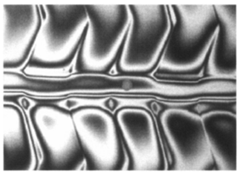
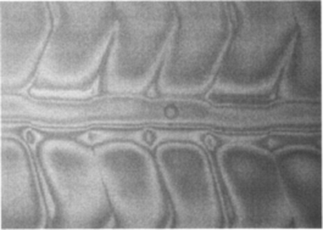
Figure 2.4: Raw Intensity (left) and Fringe-Free (right) images of an LCD panel with a SWLI [2]
The image on the left demonstrates the interference fringes that will be present in a raw intensity image taken from a SWLI. The image on the right has attempted to remove those fringes by using the algorithm described before. While it does appear to achieve this effect, one can see that the detail is no where near as good as images made on modern instruments, like that shown in Figure 2.1 for example. Because the results do not appear consistent between this method and the images we take with our SWLI, it’s unlikely that this is the method being used to generate these images.
This assumption will serve as the basis for the rest of the
paper. I am assuming that the fringe-free images are not following the algorithm
described in the Zygo publication [2].
I will also be attempting to test the null hypothesis that the new intensity images
have some connection to the heightmap, and if so whether that relationship can
be extracted and used to improve understanding of the physical meaning of the
intensity images. More generally, I will attempt to develop some meaningful
physical interpretation of the intensity map, whether it is connected to the
height map or not.
To begin my analysis, I’ll first address the possibility that height map and intensity map have some underlying connection. Here again are the sample height and intensity maps first introduced in section 2:
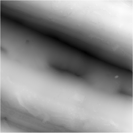
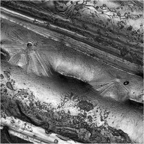
Figure 3.1: Height Data (left) & Intensity Data (right)
Clearly, these do not appear at all similar except in the broadest possible details. But just how dissimilar are they? In order to properly assess the “similarity” of the various representations we’ll be looking at, I must first introduce a metric that we can apply to differentiate between “good” matches and “bad” matches. Fortunately, MATLAB natively offers a few techniques for doing this. The two most obvious choices for this are the Mean Squared Error, and the Structural Similarity Index.
3.1 Image Comparison Metrics
The Mean Squared Error, as the name suggests, is the average distance from the mean squared, the mean in this case being the difference between the two relevant images. The equation is given by:
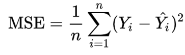
Equation 1: Mean Squared Error [3]
It is also, notably, the square of the RMS, or root mean square. The RMS is commonly used as a measure of surface roughness of surfaces in ISO standards. I think this makes it a compelling choice for comparing the various images I’ll be generating. While this is a purely statistical comparison, the Structural Similarity Index is a higher-level comparison that attempts to go beyond purely mathematical differences and account for perceptual similarities and differences. The equation is given as:

Equation 2: Structural Similarity Index [4]
Where the parameters defined as:
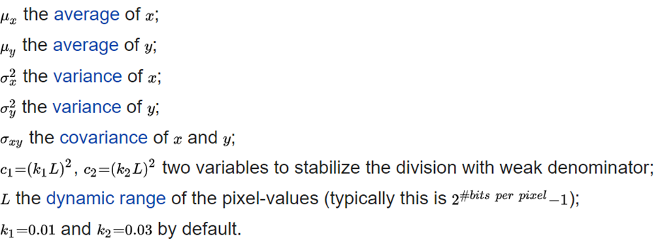
Because this attempts to account for similarities beyond the purely statistical differences described by the MSE, I will also utilize this metric when doing my comparisons. With these metrics established, I can now attach numbers to how dissimilar these two images are:
|
Reference Image: |
Intensity Map |
|
Comparison Image: |
Height Map (unfiltered) |
|
MSE: |
0.0942 |
|
SSIM: |
0.2548 |
Table 3.1: MSE & SSIM for Unfiltered Height Map
Both the intensity and height maps were normalized before computing the comparison metrics, which will be the standard procedure. These numbers will serve as the base line as we compare more images. A smaller MSE than that in Table 3.1 will indicate a more similar image. Conversely, a larger SSIM will indicate a better fit.
3.2 Height Map Filtering
In order to achieve a better comparison between the height map and the intensity map, I can apply a filter to remove either the high or low frequencies from the measurement to see if that provides a better match between the two images. For this purpose, I will use a time-domain filter, or convolution filter. This filter will have the following form:
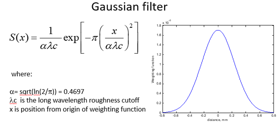
Figure 3.2: Gaussian Time-Domain Filter Specifications [5]
Using this form (modified for 2 dimensions), I can apply both lowpass and highpass filters to the height map and attempt to identify if there is an optimal filter that will lead to a meaningful similarity between the two data sets. Doing this while varying the cutoff frequency and plotting the progression of the MSE and SSIM can tell us where any local minima and maxima of similarity might exist:
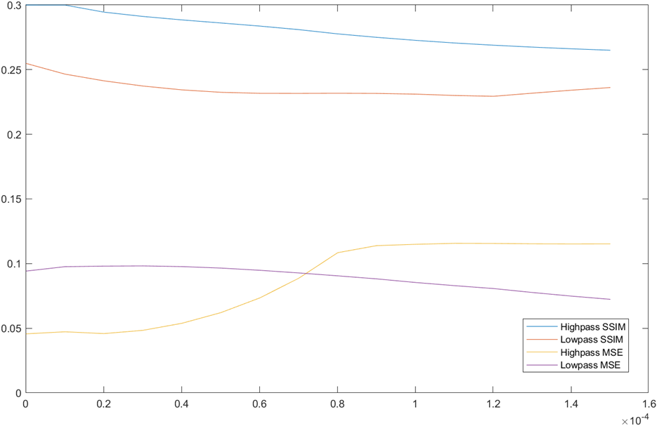
Figure 3.3: SSIM and MSE vs λc for Highpass and Lowpass filters
It appears from this plot, that our MSE is minimized and SSIM is maximized by using a highpass filter to remove the lowest frequencies. We can zoom in on this region to better identify our optimal cutoff frequency:
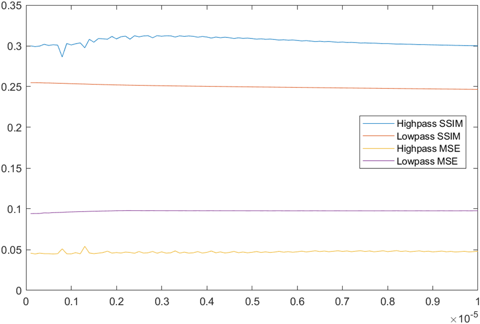
Figure 3.4: SSIM and MSE vs λc for Highpass and Lowpass filters
Apparently, the optimal cutoff frequency for the high pass filter is ~3 µm, with a SSIM of ~.3118. Here is a comparison of the optimally filtered height map and the intensity map:
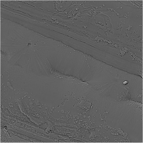
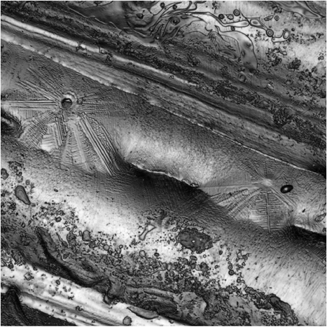
So, while these do appear more similar than the raw height map and the intensity map, as indicated by the slightly higher SSIM, they don’t appear to have what you could call a meaningful relationship, beyond representing the same region on a surface and having some minor feature similarities.
Clearly there isn’t any meaningful connection directly between the height map and the intensity map. Or at least between the height and the intensity. Considering the nature of the instrument making the intensity measurement it’s possible we can construct an appropriate model that will interpret the height map into something that will resemble the intensity map. The SWLI is, essentially, a reflection microscope. This operates on the principle that the surface is illuminated from the objective, and the light that is reflected back into the objective are detected on the camera. This means there is a limit on how steep of surfaces can be measured, since too steep of a surface will reflect light away from the objective. This is illustrated by the following diagram:
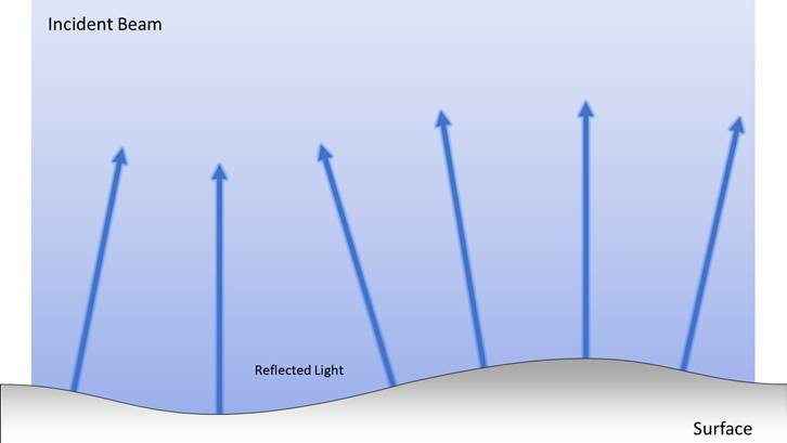
Figure 3.5: Varying reflection angle from bumpy surface
From this observation, one could imagine that flat areas will reflect more light back to the microscope than sloped areas, and the steeper the slope the less light will be reflected. If this is the case, then the gradient of the height map should be inversely related to the magnitude of the intensity. I’ll test this hypothesis in the next section.
Applying a gradient function to the height map, inverting it, and matching the histogram to the intensity image yields the following result:
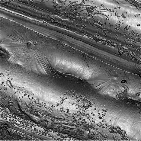
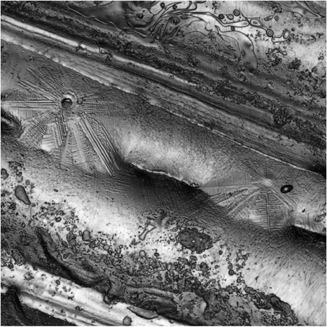
Figure 4.1: Gradient Map (left) and Intensity Map (right)
This looks much more promising than a simple filter like we were doing before. The critical step here, I’ll note is, performing the histogram matching, however. Without performing a histogram matching operation, the inverted gradient map looks like this:

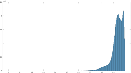
Figure 4.2: Gradient map with unmatched histogram
Clearly this representation does not resemble the intensity map. Histogram matching re-bins the pixel values to better match the desired image. While this image appears to match our target, we should still measure just how well it matches to determine if we can say that there is any meaningful relationship between them. Performing the same MSE and SSIM function as before gives the following:
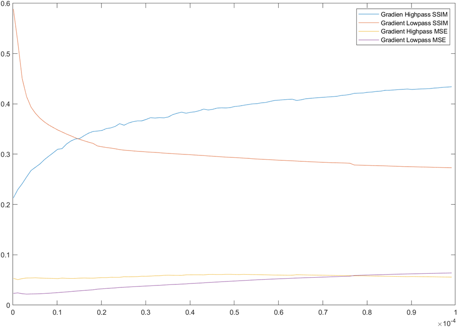
Figure 4.3: Gradient Map MSE and SSIM vs Cut-off Wavelength for Highpass and Lowpass maps
Apparently, the optimal filtration for this gradient map is none at all! The MSE and SSIM in this case are given below:
|
Reference Image: |
Intensity Map |
|
Comparison Image: |
Gradient Map (unfiltered) |
|
MSE: |
0.0233 |
|
SSIM: |
0.5885 |
Table 4.1: MSE and SSIM for Gradient Map
The SSIM for this case is nearly 3x higher and the MSE is roughly 4x lower than with the raw height map. Clearly this is a much closer representation of the intensity map than the height map, and also provides some insight into the origin of the intensity map’s information. However, perusing the MX manual can perhaps provide even deeper insight!
Looking at the manual, we find the following passage on fringe removal algorithms:
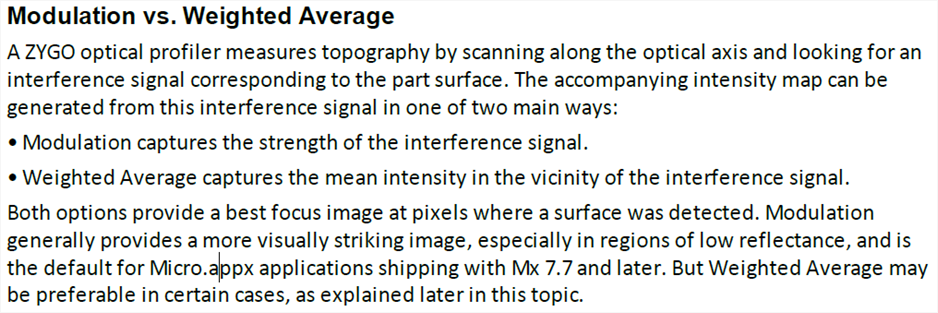
Figure 5.1: Fringe-Removal Passage from MX Manual [6]
According to this section, the modulation of the interference signal is what is being shown in the intensity image. If you recall, the relative location of the peak of the modulation is what determines the height value. This implies that the relative size of the modulation peak is what is being used for the intensity signal, as illustrated here:
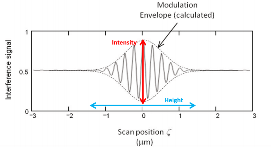
Figure 5.2: Modulation envelope with height and intensity axes
This suggests that the height and the intensity are two linearly independent quantities, and one can likely not be derived from the other. This raises the question, then, how can we test the validity of the idea that the intensity map is derived from the modulation. Thankfully, Mx happens to record one more piece of data in addition to the intensity and the height maps: the quality map. A quick comparison of the quality map suggests that they might be related:
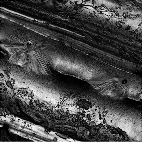
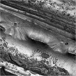
Figure 5.3: Quality Data (left) & Intensity Data (right)
But without knowing where the “quality” map comes from this doesn’t do us much good. I was able to get in contact with zygo, however, and they verified that the quality data is inherently connected to the modulation of the signal, representing the signal-to-noise of each pixel. Knowing this, we can compare the quality data to the intensity data to confirm that the intensity is indeed derived from the modulation of the signal. First, I will do a histogram match to the quality data:
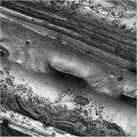
Figure 5.4:Histogram Matched Quality Data (left) & Intensity Data (right)
These look very similar now. Let’s check the MSE and the SSIM to see just how similar they are:
|
Reference Image: |
Intensity Map |
|
Comparison Image: |
Quality Data |
|
MSE: |
3.13E-04 |
|
SSIM: |
0.9858 |
Table 5.1: MSE and SSIM of Quality Data:
So we’ve reduced the MSE by about an order of magnitude and added another 30 points to the SSIM, so clearly this is the best match yet. I would go as far as saying this verifies that the intensity image is derived from the modulation information given how close to zero the MSE has become.
So we have determined the origin of the intensity data. It appears, based on a number of sources including the manual and a direct comparison, that the intensity data comes from the modulation of the interference signal. But what does this mean physically? Have we learned anything about the physical meaning of the intensity signal?
Clearly the modulation will be proportional to the reflectance of the surface, so it does perhaps tell us something about the relative reflectance of each point on the surface. The fact that the gradient of the height map appears so similar to the intensity map does also suggest that the intensity map carries information about the slope of the surface at any given point. In theory, then, we could integrate the intensity map and get something that resembles the height map just as the gradient of the height map gave use something resembling the intensity map. Doing this, and subtracting the best fit plane gives us the following result:
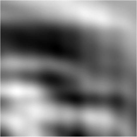
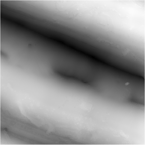
Figure 6.1: Integrated Intensity map (left) & Height Map (right)
These don’t look especially similar, but there is a moderate resemblance between some of the various features. We can calculate the MSE and SSIM of this as a better comparison:
|
Reference Image: |
Height Map |
|
Comparison Image: |
Integrated Intensity |
|
MSE: |
4.37E-02 |
|
SSIM: |
0.8867 |
Table 6.1: SSIM and MSE for Integrated intensity
Wow, actually pretty good match based on the metrics! Not too far from the gradient/intensity comparison, which makes sense since it’s the analogous calculation. So this would suggest that magnitude of slope is not an entirely unreasonable physical interpretation of the intensity images.
One additional benefit of learning that the intensity image is derived from the modulation is the realization that the two sets of information are linearly independent, so to speak. Referring to Figure 5.2: Modulation envelope with height and intensity axes, one is determined from the ‘Y-axis’ and one is determined by the ‘X-axis’. This means that we can freely superimpose these two sets of information and not fear that we are have any underlying interferences between the two data sets. The most natural way I can think of to do this is to simply use the height to determine the color of any given pixel, and the intensity to determine the brightness. Doing that gives us something that looks like:
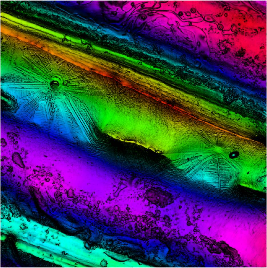
Figure 6.2: Color Mapped Intensity Image
This representation, in addition to looking kind of cool, allows us to see simultaneously the information contained in the height map and the intensity maps.
More specifically, this allows us to see that the dendrites, that appeared to be sitting on a flat plane looking only at the intensity image, are in fact on the sloped surface of a valley. I can also do things like wrap the intensity image onto the height map, giving us something like:
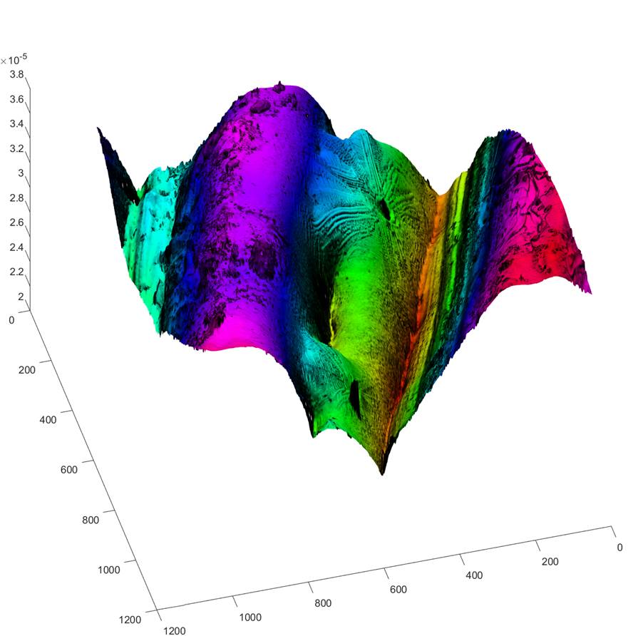
Figure 6.3:Wrapped Intensity Map
This view allows us to see even more clearly the structure
associated with the features visible in the intensity map.
In conclusion, I was able to fairly conclusively determine
that the intensity map has no inherent relationship to the height map, whether
it is filtered or not. I was able, however, to determine that there is some
connection, that is more of a connection, between the intensity map and the gradient
of the height map. I believe that his connection is somewhat illuminating
of the physical meaning of the intensity maps, which is something like the
inverse of the slope of the surface, which intuitively makes sense in light of
the fairly conclusive determination that the intensity map is derived directly
from the modulation of the signal. For regions that are sloped more steeply, we
fully expect to get less modulation, since more light is lost and vise versa.
Integrating the intensity map and comparing to the height map somewhat verified
this notion, though only in the numerical comparisons as the visual comparison
was not entire similar.
8.1 Root Mean Square
While not exactly the same as the Iso standard, the Mean Squared Error metric utilized to determine the similarity level between the two images (Equation 1: Mean Squared Error [3]) is very similar to the ISO standard of root mean square or RMS:
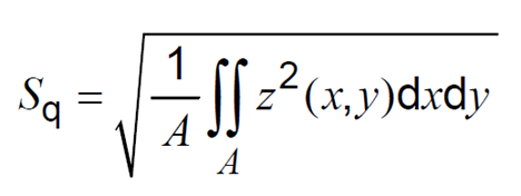
Equation 3: Root Mean Square
This definition is taken from ISO 25178-2-2020 section 4.1.1.
8.2 Filters
I also made use of a gaussian filter, which is also governed by Iso standards.
The specifications for the gaussian filter I made use of are
found in ISO 16610-61.
9.1 Areal filter & Image Comparisons
close all
result = zeros(1,10);
n=1;
figure
tiledlayout(4,2)
for j = 1e-7:1e-6:1e-4
alpha = .4697;
lambdac = j;
dx = xRes;
surfaceData = fillmissing(surfaceData,'movmedian',10);
Sx=(-lambdac:dx:lambdac);
Sy=(-lambdac:dx:lambdac);
[SX,SY] = meshgrid(Sx,Sy);
S=(1/alpha*lambdac).*exp(-pi*(sqrt(SX.^2+SY.^2)/alpha/lambdac).^2);
N = 512;
SD = padarray(surfaceData,[N,N], 'both','replicate');
rect = [size(S,1)/2 - N/2 size(S,1)/2 - N/2 N N];
S = imcrop(S,rect);
S = S/sum(sum(S));
I = imfilter(SD,S,'same');
rect = [N N 1023 1023];
LP = mat2gray(imcrop(I, rect));
HP = mat2gray(mat2gray(surfaceData) - mat2gray(LP));
gradHP = mat2gray(imgradient(HP));
gradHP = imhistmatch(mat2gray(1-gradHP),mat2gray(intensityData));
gradLP = mat2gray(imgradient(LP));
gradLP = imhistmatch(mat2gray(1-gradLP),mat2gray(intensityData));
gradSD = mat2gray(imgradient(surfaceData));
gradSD = imhistmatch(mat2gray(1-gradSD),mat2gray(intensityData));
nexttile(1)
imshow(surfaceData,[])
nexttile(2)
imshow(S,[]);
title(j)
nexttile(3)
imshow(LP,[])
nexttile(4)
imshow(HP,[])
nexttile(5)
imshow(gradLP,[])
nexttile(6)
imshow(gradHP,[])
nexttile(7)
imshow(gradSD,[])
nexttile(8)
imshow(intensityData,[])
drawnow
result(n,1) = j;
result(n,2) = ssim(mat2gray(HP), mat2gray(intensityData));
result(n,3) = ssim(mat2gray(LP), mat2gray(intensityData));
result(n,4) = immse(mat2gray(HP), mat2gray(intensityData));
result(n,5) = immse(mat2gray(LP), mat2gray(intensityData));
result(n,6) = ssim(mat2gray(gradHP), mat2gray(intensityData));
result(n,7) = ssim(mat2gray(gradLP), mat2gray(intensityData));
result(n,8) = immse(mat2gray(gradHP), mat2gray(intensityData));
result(n,9) = immse(mat2gray(gradLP), mat2gray(intensityData));
result(n,10)= ssim(mat2gray(gradSD), mat2gray(intensityData));
n = n + 1;
end
figure
plot(result(:,1), result(:,2),result(:,1), result(:,3),result(:,1), result(:,4),result(:,1), result(:,5),result(:,1), result(:,6),result(:,1), result(:,7), result(:,1), result(:,8),result(:,1), result(:,9),result(:,1), result(:,10))
legend('Highpass SSIM', 'Lowpass SSIM', 'Highpass MSE', 'Lowpass MSE', 'Gradien Highpass SSIM', 'Gradient Lowpass SSIM', 'Gradient Highpass MSE', 'Gradient Lowpass MSE','Gradient Surface Data')
9.2 Intensity Integration
iHMx = cumtrapz(x,mat2gray(intensityData));
iHMy = rot90(cumtrapz(y,rot90(mat2gray(intensityData))),3);
z = mat2gray(iHMx + iHMy);
9.3 Create Color Mapped Intensity Image
HSV = ones(1024,1024,3)*.75;
HSV(:,:,1) = mat2gray(surfaceData);
HSV(:,:,3) = histeq(mat2gray(intensityData));
RGB = hsv2rgb(HSV);
nexttile
imshow(RGB);
[X,Y] = meshgrid(1:1024,1:1024);
nexttile
warp(X,Y,surfaceData,RGB)
colormap hsv
colorbar
1. Leach, R., Optical Measurement of Surface Topography. 2011, Springer Berlin / Heidelberg: Berlin, Heidelberg.
2. de Groot, P., Generating fringe-free images from phase-shifted interferometry data. Applied Optics, 2005. 44(33): p. 7062-7069.
3. Mean Squared Error. Available from: https://en.wikipedia.org/wiki/Mean_squared_error.
4. Structural Similarity. Available from: https://en.wikipedia.org/wiki/Structural_similarity.
5. Evans, C., Advanced Surface Metrology - Filtering. 2020.
6. Mx Reference Guide, in Modulation vs. Weighted Average. 2020, Ametek: zygo.com.